Healthy brand that packs a punch
Nākd
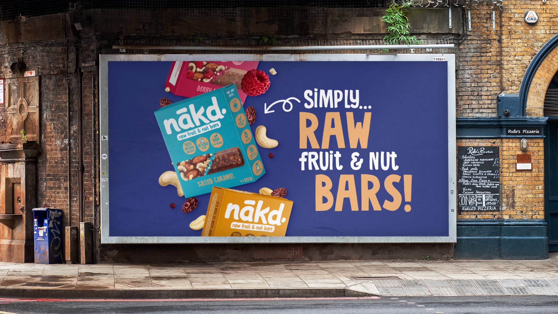
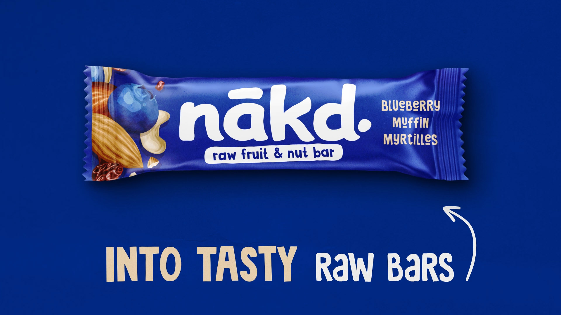
Bringing Nākd’s identity to life through playful, stop-motion-inspired animation.
The Brief
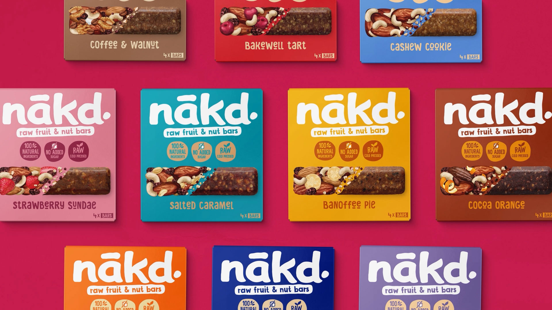
BrandMe developed a fresh new brand identity for Nākd. New packaging, a new logo, typography, a bold colour palette and more. They needed a way to bring it all together and show it off, without it feeling like a static gallery of assets.
The brief called for a short, fast-paced motion piece that could move through a wide range of designs and artwork quickly, while staying engaging enough to hold attention. Just as importantly, the animation itself needed to feel like Nākd. Not just showing the branding, but embodying it.
Our Approach
Working from a storyboard developed by the BrandMe team, we brought the new identity to life through motion, translating each element of the rebrand into fast, energetic sequences that showcase the range of packaging and artwork without losing pace or personality. Every beat was built to reflect the spirit of the brand itself: playful, natural, and full of energy, echoing what Nākd stands for.
The Craft
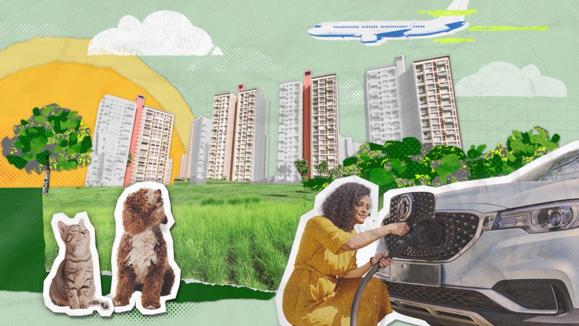
To give the animation a hand-crafted, natural quality, we developed a stop-motion-inspired style throughout. Subtle texture was layered in to reinforce that handmade feel, and it wasn't just applied to the visuals. It shaped the motion itself. From the way boxes and packaging moved to how the typography appeared on screen, every piece of movement was designed to feel tactile, organic, and true to the brand.